
Showing posts with label Biblical Impressions. Show all posts
Showing posts with label Biblical Impressions. Show all posts
Monday, October 5, 2015
More Mosaic Fun
Once again, I could not seem to take a decent photograph of a shimmery card. The combination of the mosaic pattern with the powders is really amazing. After awhile, mica powders lose their shine, but a Swiffer dry cloth brings it back instantly. This is my final entry in the Verve Autumn Lovelies challenge, ending today.


Sunday, October 4, 2015
Gold Leaf
It's difficult to have gold show up in all its sparkle, at least with my camera! I had made several of the background panels (beige vellum stamped with gold-ink leaves), but never found the right use for them. I actually threw a couple of them out, but just kept this one. Then a couple of days later I got the idea of adding a leaf stamped with gold, and I'm really happy at how it turned out ... and sorry I tossed the other panels I'd done! This is another entry for the Verve Autumn Lovelies challenge.


Friday, October 2, 2015
He is Become My Salvation
I'm submitting this card to Verve Autumn Lovelies challenge and to Word Art Wednesday's challenge.


This scripture is a
song of praise following a prophecy, in chapter 11, foretelling the
birth of Christ. It is a joyous prophecy, following one in chapter 10
largely addressing the wrath of God toward his people for his sin. But
God does not stay angry forever, and in an incredible act of love, declares
that he will send a savior:
Isaiah 11: 11
A shoot will come up from the stump of Jesse;
from his roots a Branch will bear fruit.
2 The Spirit of the Lord will rest on him—
the Spirit of wisdom and of understanding,
the Spirit of counsel and of might,
the Spirit of the knowledge and fear of the
Lord—
3 and he will delight in the fear of the Lord…
So, God says through Isaiah in chapter 12, we will respond, saying:
“I will praise you, Lord.
Although you were angry with me,
your anger has turned away
and you have comforted me.
2 Surely God is my salvation;
I will trust and not be afraid.
The Lord, the Lord himself, is my strength and my defense;
he has become my salvation."
3 With joy you will draw water
I will trust and not be afraid.
The Lord, the Lord himself, is my strength and my defense;
he has become my salvation."
3 With joy you will draw water
from the wells of salvation.
4 In that day you will say:
“Give praise to the Lord, proclaim his name;
make known among the nations what he has
done,
and proclaim that his name is exalted.
5 Sing to the Lord, for he has done glorious things;
let this be known to all the world.
6 Shout aloud and sing for joy, people of Zion,
for great is the Holy One of Israel among
you.”
Let’s spread the word about the greatness of our God and His
salvation!
Thursday, October 1, 2015
Simply Apples
When I make cards, I often make duplicates of panels or text; this card came from card that had gotten ruined, so needed a redo. I am submitting this to the Verve Autumn Lovelies Challenge, though I think it's more of a cute and simple autumn card rather than a lovely one! :-) I'm also submitting it to Word Art Wednesday's Anything Goes challenge.


Tuesday, April 21, 2015
A Month of Sundays ... A Stamped Journal for Sermon Notes
For probably ten years I have wanted to do this project for my pastor's wife, but there never has been the time. There wasn't time this year either, but they're of an age where retirement could come soon, so I wanted to get this DONE! I had a lot of ideas that there just was not time for, so many of the stamped pages are sadly simple, and a few of the pages were "card parts" I had never used ... I'm so glad I save those! My goal was to create a journal that could take care of anything coming up on a Sunday. For each month there was a prayer request page, and six lined pages for note-taking (one per week, with an extra page or two just in case!), and a calendar. I used cardstock for the stamped pages. The back cover had a ribbon to mark her place. I had no time to design a cover, so used one I had already made into a basic journal.


Saturday, October 13, 2012
MoreTiles!
Well, I had planned to post a few days ago for Biblical Impressions, but when I photographed the tiles, the picture turned out awful. As I mentioned in my last post, I accidently sprayed these tiles, made this summer before college started up again, with glue instead of sealer. While the glue darkened and dulled the tiles, they still looked okay, but these two just didn't photograph well. So, I decided to remake them this weekend after (hurrah!!) I finished my last assignments for this quarter.
First, I want to show you a tile before I stamped on them. As you can see, these are not smooth ceramic tiles, but are tumbled tiles. When you choose your tiles, be sure to be aware of the grooves and pits. On my sunflower tile, I did not notice that, and around the edges, it doesn't quite have the smooth look of the original.
I wanted to make a masculine looking tile, so this is it. I applied my green Stazon pad directly to the tile. I embossed the plaid stamps in copper. When I first photgraphed this second set of tiles, I though the white cracks (from the tile) made the tiles not look really nice, though it is a more natural look, so I inked in some more green on this, and yellow on the next tile.

Now, in case you were wondering if the glue really had made all that difference, here is the tile, same copper embossing, though maybe a different green:

I used the Sunflower Background for this stamp, after applying yellow to the tile. I edged the tile first in brown, then yellow as the brown was too far to the edge, then edged in once more with butterscotch. I liked the color, and decided to daub it on the sunflower centers as well.

Unlike the plaid tile, I covered all of the tile surface with ink.
Here is the tile before I altered it (note, photographing on wood vs. countertop yielded different appearance fo the yellow):

So, those are the tiles I recreated for this post. But as long as I finally had a chance to play with my stuff, I made a couple of Christmas tiles. These are your standard ceramic glazed tiles. I got a bunch for next to nothing at a place called "Why buy new" which has all sorts of fun used stuff. I've discovered, from a flawed tile that I had been using as a coaster just to determine this, that embossing handles use very well. So, I used embossing on both of these. First, however, I applied alcohol ink to each of them. For the tile with the Our Lord circle image, I decided to emboss the sides with gold. I probably won't do it often: embossing on tile (either kind) takes FOREVER, so I may try something else next time. For the sectioned tile (same size as the single tiles), I used Glory to God and holly from the discontinued line of BI stamps still available.


First, I want to show you a tile before I stamped on them. As you can see, these are not smooth ceramic tiles, but are tumbled tiles. When you choose your tiles, be sure to be aware of the grooves and pits. On my sunflower tile, I did not notice that, and around the edges, it doesn't quite have the smooth look of the original.
I wanted to make a masculine looking tile, so this is it. I applied my green Stazon pad directly to the tile. I embossed the plaid stamps in copper. When I first photgraphed this second set of tiles, I though the white cracks (from the tile) made the tiles not look really nice, though it is a more natural look, so I inked in some more green on this, and yellow on the next tile.

Now, in case you were wondering if the glue really had made all that difference, here is the tile, same copper embossing, though maybe a different green:

I used the Sunflower Background for this stamp, after applying yellow to the tile. I edged the tile first in brown, then yellow as the brown was too far to the edge, then edged in once more with butterscotch. I liked the color, and decided to daub it on the sunflower centers as well.

Unlike the plaid tile, I covered all of the tile surface with ink.
Here is the tile before I altered it (note, photographing on wood vs. countertop yielded different appearance fo the yellow):

So, those are the tiles I recreated for this post. But as long as I finally had a chance to play with my stuff, I made a couple of Christmas tiles. These are your standard ceramic glazed tiles. I got a bunch for next to nothing at a place called "Why buy new" which has all sorts of fun used stuff. I've discovered, from a flawed tile that I had been using as a coaster just to determine this, that embossing handles use very well. So, I used embossing on both of these. First, however, I applied alcohol ink to each of them. For the tile with the Our Lord circle image, I decided to emboss the sides with gold. I probably won't do it often: embossing on tile (either kind) takes FOREVER, so I may try something else next time. For the sectioned tile (same size as the single tiles), I used Glory to God and holly from the discontinued line of BI stamps still available.


Tuesday, September 25, 2012
Mansion

Have you ever started a card, put it aside, and then forgotten just what you planned to do with it?
I'm posting for Biblical Impressions today. I wasn't exactly sure what I would do with this card, in fact, I'm still not sure ... the we've moved text is attached with temporary bond - we're not moving! But my mind was a complete blank ... I can't remember what I had in mind when I ordered it this pretty mansion! I love stone and brick houses, and I don't own any other stamps with a home on it, so perhaps that was reason enough!
The birds are not part of a stamp ... they're covering a blot of blue ink. I'm always nervous adding something like this, but fortunately, it turned out!
Tuesday, September 11, 2012
Yesterday I posted leaf cards for Eureka, so today I am posting leaf cards for Biblical Impressions. I love how different techniques can create a completely different look for the same image!
This first card is just a nice, simple monochromatic card, a quick and easy card for a no-frills recipient.

For these leaves, I used gold leaf. I am happy with the look, though I think I could have gotten the same effect with metallic/mica powders; gold leaf is shown to best effect with stamps that have thicker lines/images.

This first card is just a nice, simple monochromatic card, a quick and easy card for a no-frills recipient.

For these leaves, I used gold leaf. I am happy with the look, though I think I could have gotten the same effect with metallic/mica powders; gold leaf is shown to best effect with stamps that have thicker lines/images.

Thursday, August 16, 2012

Tuesday, July 24, 2012
Piano thanks

This is a design I made a set of for a friend of ours, Benjamin, who is an absolutely marvelous composer. I stamped the piano first, masked it, then stamped the music score.
Saturday, July 14, 2012
His Plans...

Jeremiah 29:11 is a favorite verse of many, though one that is not
often read in context.
Stampin' Sisters in Christ is a blog I had heard of some time back,
but never had time to really “explore.” A link from one blog to
another led to my happy rediscovery of it this week. It really
caught my attention because of the theme of their weekly challenge, Jeremiah
29:11. Our church is on rotation with other churches for Sunday
services at the local jail, and a few weeks it was my turn to share with the
women. I must have said something about God’s plans for us, and a
young woman burst out in anger, “I used to go to church, but they were always
talking about God’s plan for my life and I just don’t get that!
I’m here in jail and I sure don’t see God’s plan in this!”
Most people when they think of this verse see it as a promise to each of
us individually that God has happy, wonderful things in store for us right
around the corner. But it’s always important to read the Word in
its original context. Jesus tells us he came to give us abundant
life, and Paul tells us in Ephesians 2:10 that “we are God’s workmanship,
created in Christ Jesus to do good works, which God prepared in advance for us
to do,” so it’s not necessarily wrong to use Jeremiah 29:11 this way, but for
people like my young friend in jail (who was released, then did something else
to land her back there, possibly for a serious amount of time), it can be a
source of great distress and bitterness.
If we
look at the context of the verse, we see that God was not speaking to
individuals, but to the captive people of Judah. The people of God
had sinned themselves into exile, had been banished from their beloved
Jerusalem, and were living under Babylonian rule. The
pronouncement of Jeremiah 29:11 is that “when seventy years are completed for
Babylon, I will come to you and fulfill my gracious promise to bring you back to
this place (Jeremiah 29:10). Seventy years! For
those that were old enough to comprehend this message, they were essentially
being told that after nearly all of them had died, then they would
they realize that future and hope! Furthermore, God tells them
that while they are in captivity, they are to make a good life for
themselves! They are to marry, have children, build houses, and be
at peace in their captivity! And while in that state, they are
even to pray for the prosperity of the very city holding them captive!
Wow … a very different concept than the one we are led to consider when
reading this verse apart from its original setting and purpose! Is
it not equally inspiring to read this in context? Earth is not the
Christian’s true home, but we are called to engage with the culture, praying for
those who make life difficult for us, with the confidence that one day, God will
lead us home!
Stamp is from Biblical Impressions, found in both the "verses" section, which I used for this card, and as a bookmark stamp as well. It also is available from Eureka. In fact, for some reason, when I mentally composed this card a few days ago, it was the Eureka stamp I envisioned, which to my surprise I do not even own, so I had to refigure it for this challenge. So, having not had a chance to create until this afternoon, I made a much simpler card than I had anticipated, lol! I usually conceal the prongs of the brads under layers of cardstock, but I did not do that for this card, wanting to be able to remove the flower embellishment if this ends up being sent to a male recipient. :-)
Tuesday, July 10, 2012
Baby Carriage

I'm posting a card from Biblical Impressions today! I have a bunch of babycards from when I used to sell cards, but all I have left are boy blue or girl pink cards. I forgot about this, until I went to grab a card from my stash for a baby shower last week. The couple has decided not to discover the baby's gender in advance. So, off to work I went!
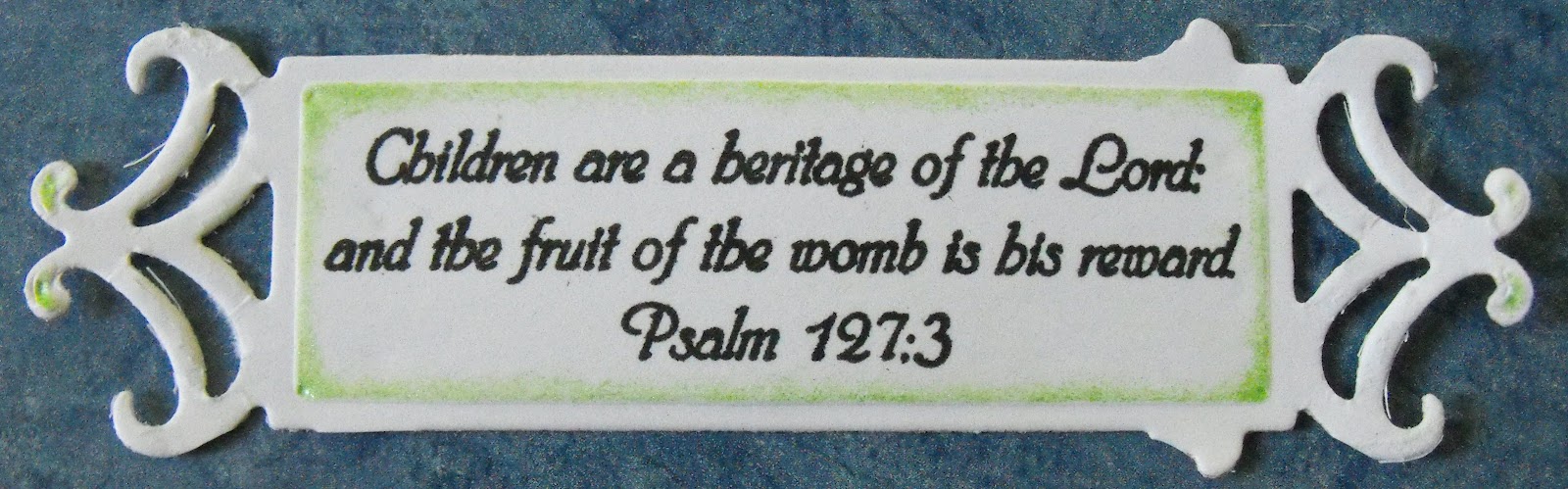
Details: I stamped the small carriage image from Biblical Impressions four times (there is a larger size as well). I cut out the wheels from one set, colored the rims with black pencil, then used my versamark pen for the wheel hubs, and embossed in silver. I cut out the carriage body, sans wheels and the portion of the ribbon that is off the carriage, and colored teh blanket and lace. Then I cut the carriage out again, this time also eliminating the lace and the blanket. This step could be skipped, but I wanted the extra layer. I used a slightly textured cardstock for the ribbon to give it a more fabric-like look. I assembled the pieces, and attached to the circle. The Psalm127:3 scripture was simply stamped with black.
In all honesty, this was a very time consuming card ... not because the card itself was that difficult, but I just kept smearing black ink or pencil on the white suraces! I forgot my habit of keeping a wet baby wipe on hand to keep rubbing my fingers on while working with color on white! Additionally, the spellbinder die was a nightmare to work with. Note to self: anytime purchasing a new set, I need to immediatley test all dies while I still have the return receipt! I used another die in the set a couple of months ago with no problem, but this one ... wow! Kristie just gave me a tip on this: use waxed paper between the die and the paper and it will come out a lot easier. I will try this next time. However, just to give you ideas in case this doesn't work, I'll still post the pictures I took of what I did:
As you see, three corners were torn off in the effort to extract the piece.

After that one, I thought I would try again, this time with some very strong cardstock I have. The results were just slightly better. I cut it down to this, I thought I'd show it as it looked before weaving the ribbon through:

I went back to the first one, to show you two other possibilities I could have done. I decided it looked a bit weird, so I trimmed it down more, but for a different style card, it might have worked (notice I trimmed the little side nobs on one end):
Monday, July 2, 2012
July 4th

Wow, July 4th just two days away?
Is America a Christian Nation? Was it ever? I don't believe the majority of the founding fathers saw it that way. What they did see was the need for a nation in which one could worship as one wished, and Christian principles were used in much of the decision making. Or perhaps a better way to phrase it is that the Christian principles by which most of the founding fathers lived by strongly influenced their thinking. To be sure, many were deists, but the Patrick Henry quote indicates that many were dedicated Christian believers.
After stamping the flag background, I filled in the lines with H20 watercolors. I actually did this part a couple of years ago, but didn't really like the effect. But when I looked at it this week, I decided that it would work well as a background for the text. I stamped on vellum with blue Stazon, and after gluing and burnishing, placed it under weights for about 48 hours to make sure I would not see the vellum curl up on itself down the road.
Friday, June 15, 2012
Father's Day already???

Once again, I forgot until last minute that I needed a Father's Day card ... even though I gave my existing ones to my husband to choose from for his dad!
I needed a really simple design, and somewhere in my searches for inspiration, I saw a card with leaves. My husband is not into sports, cards, hunting or golf, so a basic nature card seemed right. I had not yet used the gorgeous white wood-look cardstock, and was really pleased with how it looked. The brown behind the Father's Day text is the same pattern, it just did not show up in the photo.
I love these skeleton leaves from Biblical Impressions! I usually emboss them, but for a masculine card, dye ink seemed a better choice!
Wednesday, June 13, 2012
Simple Scripture Card

I love when elegance and simplicity come together in a card! The background is a darker beige than what you see here, and keeps the card from being too dark. The Romans 15:13 scripture was embossed in gold. The gorgeous, dimensional background is from a wallpaper sample book. Our local Sherwin Williams is always happy to pass these on to customers. I think someone has an "in" with one of the employees, because certain themes have always been gone when I get there, and I usually get there immediately after they say they remove the books from the shelves! Fortunately, the really elegant themes, and sometimes really amazing textured themes, are usually left. I have made journals as well with this particular pattern, and they've been the first to sell. I also have covered shoe boxes with wallpaper. It strengthens the box, as well as making it a decorative item, and one that easily wipes clean.
Subscribe to:
Posts (Atom)