Reading scripture in context is always a good thing. The scripture on this card comes as part of an exhortation from God to the Israelites when they have reached the promised land. The verse reads in its entirety: "Remember how the Lord your God led you all the way in the wilderness these forty years, to humble and test you in order to know what was in your heart, whether or not you would keep his commands." Leading us that we would be humbled and tested? That can be enough to run from the Lord's leading! And yet, reflecting on the parting of the waters, the provision of manna, and the provision of the law that would one day lead us to the knowledge of our need for grace in Christ, we see that his leading involves beautiful, wonderful things, that he is faithful to provide for us even as he teaches us. What a wonderful God we serve!
I love taking a single stamp or embossing folder and see how many ways I can work with it. This background was made with a Darice leaf folder and Tim Holtz' Craft Core paper. I accidentally embossed it on the wrong side. (Actually, to my disgust, I embossed several sheets of it backwards, ugh!!!). Hmmm... what to do? The other side looked nice, but of course I couldn't sand it down to reveal the paper underneath. So I used a roller to ink the "correct" side, then ran it through my Cuttlebug underneath the folder to flatten it just a bit, then put it into the embossing folder on the correct side. I then ran it through the cuttlebug again, and then rolled green ink over the newly embossed panel. I tried various other ideas on the other goofed pieces; it was so much fun! Alas, I ran out of time to make any more cards with those panels!
I am entering this into the Our Daily Bread Designs Background Challenge and Word Art Wednesday's Anything Goes Challenge, and Verve Autumn Lovelies Challenge.
Showing posts with label scripture. Show all posts
Saturday, October 3, 2015
Friday, October 2, 2015
He is Become My Salvation
I'm submitting this card to Verve Autumn Lovelies challenge and to Word Art Wednesday's challenge.
This scripture is a
song of praise following a prophecy, in chapter 11, foretelling the
birth of Christ. It is a joyous prophecy, following one in chapter 10
largely addressing the wrath of God toward his people for his sin. But
God does not stay angry forever, and in an incredible act of love, declares
that he will send a savior:
Isaiah 11: 11
A shoot will come up from the stump of Jesse;
from his roots a Branch will bear fruit.
2 The Spirit of the Lord will rest on him—
the Spirit of wisdom and of understanding,
the Spirit of counsel and of might,
the Spirit of the knowledge and fear of the
Lord—
3 and he will delight in the fear of the Lord…
So, God says through Isaiah in chapter 12, we will respond, saying:
“I will praise you, Lord.
Although you were angry with me,
your anger has turned away
and you have comforted me.
2 Surely God is my salvation;
I will trust and not be afraid.
The Lord, the Lord himself, is my strength and my defense;
he has become my salvation."
3 With joy you will draw water
I will trust and not be afraid.
The Lord, the Lord himself, is my strength and my defense;
he has become my salvation."
3 With joy you will draw water
from the wells of salvation.
4 In that day you will say:
“Give praise to the Lord, proclaim his name;
make known among the nations what he has
done,
and proclaim that his name is exalted.
5 Sing to the Lord, for he has done glorious things;
let this be known to all the world.
6 Shout aloud and sing for joy, people of Zion,
for great is the Holy One of Israel among
you.”
Let’s spread the word about the greatness of our God and His
salvation!
Thursday, September 3, 2015
Layerless Scripture Card
My husband writes to a friend, John, in prison. Layered cards are not permitted; if sent, they are torn apart before being given to the recipient. So, I've been trying to create cards with no layers or embellishments of any kind.
I forgot to retake the picture ... this one was taken in the evening in poor lighting, so looks a bit blue and washed out. It actually turned out really well. I stamped the background image in gray, then stamped the scripture. I then put an oval mask over the verse, and restamped the background in black, and chalked it in.
Our Daily Bread Designs has an "Anything Goes with Scripture" challenge going right now. They have lovely designs that work well on layerless cards, so for my husband's friend, I'm going to submit this and maybe another card or two in hopes of winning a $15 gift certificate that will go toward making the next card for him!
I hope this will inspire anyone who has a friend or relative in jail to get creative and be a blessing to someone who could truly use one!
I forgot to retake the picture ... this one was taken in the evening in poor lighting, so looks a bit blue and washed out. It actually turned out really well. I stamped the background image in gray, then stamped the scripture. I then put an oval mask over the verse, and restamped the background in black, and chalked it in.
Our Daily Bread Designs has an "Anything Goes with Scripture" challenge going right now. They have lovely designs that work well on layerless cards, so for my husband's friend, I'm going to submit this and maybe another card or two in hopes of winning a $15 gift certificate that will go toward making the next card for him!
I hope this will inspire anyone who has a friend or relative in jail to get creative and be a blessing to someone who could truly use one!
Tuesday, April 21, 2015
A Month of Sundays ... A Stamped Journal for Sermon Notes
For probably ten years I have wanted to do this project for my pastor's wife, but there never has been the time. There wasn't time this year either, but they're of an age where retirement could come soon, so I wanted to get this DONE! I had a lot of ideas that there just was not time for, so many of the stamped pages are sadly simple, and a few of the pages were "card parts" I had never used ... I'm so glad I save those! My goal was to create a journal that could take care of anything coming up on a Sunday. For each month there was a prayer request page, and six lined pages for note-taking (one per week, with an extra page or two just in case!), and a calendar. I used cardstock for the stamped pages. The back cover had a ribbon to mark her place. I had no time to design a cover, so used one I had already made into a basic journal.
Wednesday, October 17, 2012
James 1:22
I'm posting today for Eureka. I love the design of this James 1:22 scripture stamp. So simple to make a card with! The background panel is Japanese Ghost paper, I believe, a sort of thin, white embossed mulberry type paper. It is white, but so thin it picks up the background color.
Monday, October 15, 2012
Isaiah 40 tile
I really hesitated to post this tile, from the set of tiles I with the accidental application of glue instead of sealer which reduced the clarity of image and color, and I had also grabbed the wrong green to fill in the space below the trees. But additionally, as I have said of the other tiles, the style of these tumbled tiles just does not make for great photos, at least when I am taking them! But I am posting it despite my error and the camera's lack of sensitivity (!!) because this really is a great group of images for a tile, coming from smARTworks in a set called Hope Soars. With more detailed images, I recommend Brilliance inks only; they are the only inks, that I have tried so far, that give a relatively crisp image on tile. Also, it's especially important to look at where your nooks and crannies are before stamping an image that might be ruined by poor placement.
Saturday, July 14, 2012
His Plans...
Jeremiah 29:11 is a favorite verse of many, though one that is not
often read in context.
Stampin' Sisters in Christ is a blog I had heard of some time back,
but never had time to really “explore.” A link from one blog to
another led to my happy rediscovery of it this week. It really
caught my attention because of the theme of their weekly challenge, Jeremiah
29:11. Our church is on rotation with other churches for Sunday
services at the local jail, and a few weeks it was my turn to share with the
women. I must have said something about God’s plans for us, and a
young woman burst out in anger, “I used to go to church, but they were always
talking about God’s plan for my life and I just don’t get that!
I’m here in jail and I sure don’t see God’s plan in this!”
Most people when they think of this verse see it as a promise to each of
us individually that God has happy, wonderful things in store for us right
around the corner. But it’s always important to read the Word in
its original context. Jesus tells us he came to give us abundant
life, and Paul tells us in Ephesians 2:10 that “we are God’s workmanship,
created in Christ Jesus to do good works, which God prepared in advance for us
to do,” so it’s not necessarily wrong to use Jeremiah 29:11 this way, but for
people like my young friend in jail (who was released, then did something else
to land her back there, possibly for a serious amount of time), it can be a
source of great distress and bitterness.
If we
look at the context of the verse, we see that God was not speaking to
individuals, but to the captive people of Judah. The people of God
had sinned themselves into exile, had been banished from their beloved
Jerusalem, and were living under Babylonian rule. The
pronouncement of Jeremiah 29:11 is that “when seventy years are completed for
Babylon, I will come to you and fulfill my gracious promise to bring you back to
this place (Jeremiah 29:10). Seventy years! For
those that were old enough to comprehend this message, they were essentially
being told that after nearly all of them had died, then they would
they realize that future and hope! Furthermore, God tells them
that while they are in captivity, they are to make a good life for
themselves! They are to marry, have children, build houses, and be
at peace in their captivity! And while in that state, they are
even to pray for the prosperity of the very city holding them captive!
Wow … a very different concept than the one we are led to consider when
reading this verse apart from its original setting and purpose! Is
it not equally inspiring to read this in context? Earth is not the
Christian’s true home, but we are called to engage with the culture, praying for
those who make life difficult for us, with the confidence that one day, God will
lead us home!
Stamp is from Biblical Impressions, found in both the "verses" section, which I used for this card, and as a bookmark stamp as well. It also is available from Eureka. In fact, for some reason, when I mentally composed this card a few days ago, it was the Eureka stamp I envisioned, which to my surprise I do not even own, so I had to refigure it for this challenge. So, having not had a chance to create until this afternoon, I made a much simpler card than I had anticipated, lol! I usually conceal the prongs of the brads under layers of cardstock, but I did not do that for this card, wanting to be able to remove the flower embellishment if this ends up being sent to a male recipient. :-)
Tuesday, July 10, 2012
Baby Carriage
I'm posting a card from Biblical Impressions today! I have a bunch of babycards from when I used to sell cards, but all I have left are boy blue or girl pink cards. I forgot about this, until I went to grab a card from my stash for a baby shower last week. The couple has decided not to discover the baby's gender in advance. So, off to work I went!
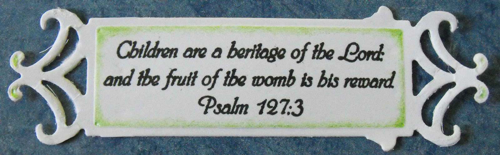
Details: I stamped the small carriage image from Biblical Impressions four times (there is a larger size as well). I cut out the wheels from one set, colored the rims with black pencil, then used my versamark pen for the wheel hubs, and embossed in silver. I cut out the carriage body, sans wheels and the portion of the ribbon that is off the carriage, and colored teh blanket and lace. Then I cut the carriage out again, this time also eliminating the lace and the blanket. This step could be skipped, but I wanted the extra layer. I used a slightly textured cardstock for the ribbon to give it a more fabric-like look. I assembled the pieces, and attached to the circle. The Psalm127:3 scripture was simply stamped with black.
In all honesty, this was a very time consuming card ... not because the card itself was that difficult, but I just kept smearing black ink or pencil on the white suraces! I forgot my habit of keeping a wet baby wipe on hand to keep rubbing my fingers on while working with color on white! Additionally, the spellbinder die was a nightmare to work with. Note to self: anytime purchasing a new set, I need to immediatley test all dies while I still have the return receipt! I used another die in the set a couple of months ago with no problem, but this one ... wow! Kristie just gave me a tip on this: use waxed paper between the die and the paper and it will come out a lot easier. I will try this next time. However, just to give you ideas in case this doesn't work, I'll still post the pictures I took of what I did:
As you see, three corners were torn off in the effort to extract the piece.
After that one, I thought I would try again, this time with some very strong cardstock I have. The results were just slightly better. I cut it down to this, I thought I'd show it as it looked before weaving the ribbon through:
I went back to the first one, to show you two other possibilities I could have done. I decided it looked a bit weird, so I trimmed it down more, but for a different style card, it might have worked (notice I trimmed the little side nobs on one end):
Wednesday, June 13, 2012
Simple Scripture Card
I love when elegance and simplicity come together in a card! The background is a darker beige than what you see here, and keeps the card from being too dark. The Romans 15:13 scripture was embossed in gold. The gorgeous, dimensional background is from a wallpaper sample book. Our local Sherwin Williams is always happy to pass these on to customers. I think someone has an "in" with one of the employees, because certain themes have always been gone when I get there, and I usually get there immediately after they say they remove the books from the shelves! Fortunately, the really elegant themes, and sometimes really amazing textured themes, are usually left. I have made journals as well with this particular pattern, and they've been the first to sell. I also have covered shoe boxes with wallpaper. It strengthens the box, as well as making it a decorative item, and one that easily wipes clean.
Thursday, June 7, 2012
Ornate Scripture
I thought this card was going to be extrememly difficult to make, especially having to cover up the original "L" at the beginning of Eureka's 1 Corinthians 13 verse so that I could use the (Garden Square) alphabet cube. I took a post-it pad and cut tiny strips to place over the L while inking.
I colored the cube with pencils, and lightly chalked the background and the filagrees with a light yellow. After stamping the L in black with versafine ink which is gives nice dark coverage, it still seemed a little light, so I added on a little black embossing powder. By the time I did so, the ink was partly dry, but it still did the job.
All images (besides the verse) are located on this same page. The whole alphabet is present, as well as several other cubes.
Friday, June 1, 2012
Geometric Fun II
As I mentioned in my last post for Biblical Impressions, I have two more designs made from the suncatcher images. I love doodling geometric designs,so despite not being into suncatchers (Native American religious symbols), I find the design wonderful for playing with.
The first thing I made with the 16 pt. suncatcher image was this flower. If you look at the original image, you can see where I cut for the petals, and where I cut for the leaves. You'll need to emboss it four times to come up with enough to cut from. Each petal layer is a single piece (2 total), though certainly you could cut out individual petals (though you'd need additional embossed images)for a more layered and perhaps more elegant look. I placed the thank you on white mulberry paper just because the card "needed" something.
The idea of making a butterfly is what motivated me to order the 8 pt. suncatcher. It certainly could be made with just one pattern, but I liked the idea of using the more angled image for the lower wings. I thought I would just create my own butterfly body, but I really am hopeless when it comes to forming shapes with pencil or scissors, so I simply used the body from Eureka's 3-D butterfly pattern. It's a little short, but the best I could do! The Proverbs 3:5,6 image is a bookmark stamp; Biblical Impressions carries a number of scriptures in this great style.
The first thing I made with the 16 pt. suncatcher image was this flower. If you look at the original image, you can see where I cut for the petals, and where I cut for the leaves. You'll need to emboss it four times to come up with enough to cut from. Each petal layer is a single piece (2 total), though certainly you could cut out individual petals (though you'd need additional embossed images)for a more layered and perhaps more elegant look. I placed the thank you on white mulberry paper just because the card "needed" something.
The idea of making a butterfly is what motivated me to order the 8 pt. suncatcher. It certainly could be made with just one pattern, but I liked the idea of using the more angled image for the lower wings. I thought I would just create my own butterfly body, but I really am hopeless when it comes to forming shapes with pencil or scissors, so I simply used the body from Eureka's 3-D butterfly pattern. It's a little short, but the best I could do! The Proverbs 3:5,6 image is a bookmark stamp; Biblical Impressions carries a number of scriptures in this great style.
Monday, May 28, 2012
Geometric Fun
I got my first suncatcher stamp in a fabulous grab bag special years ago from Biblical Impressions. I had never heard of suncatchers, so did not recognize what it was, just thought it was a neat geometric design. And although I have since heard of them, and confess I do not care to use the stamps as such, I still love the creative ideas they generate.
I made a batch of impressions of the 16 pt. suncatcher, embossing all with silver and went to work. After the first idea I had (and will post next time, actually), I decided, as the suncatchers come in four levels of "depth," that I would order the 8 pt. suncatcher. A flower was an obvious shape to make with the stamp, and I filled in with H20's. While I had planned to make a card with it, my eyes happen to light upon this little trinket box, and although the green was not a perfect match, the image looked perfect on it. I haven't permanently attached it yet, but when I do, I will use foam dots to give it a 3D look.
With the 8pt. design, A star seemed the obvious design. I embossed the image several times, embossing some in silver and some in gold. I then embossed the Psalm 36:5 scripture in gold. The panel is Yuzen Washi paper.
Next time I post for Biblical Impressions, I will have two other, very different cards made with the same stamps.
I made a batch of impressions of the 16 pt. suncatcher, embossing all with silver and went to work. After the first idea I had (and will post next time, actually), I decided, as the suncatchers come in four levels of "depth," that I would order the 8 pt. suncatcher. A flower was an obvious shape to make with the stamp, and I filled in with H20's. While I had planned to make a card with it, my eyes happen to light upon this little trinket box, and although the green was not a perfect match, the image looked perfect on it. I haven't permanently attached it yet, but when I do, I will use foam dots to give it a 3D look.
With the 8pt. design, A star seemed the obvious design. I embossed the image several times, embossing some in silver and some in gold. I then embossed the Psalm 36:5 scripture in gold. The panel is Yuzen Washi paper.
Next time I post for Biblical Impressions, I will have two other, very different cards made with the same stamps.
Tuesday, May 1, 2012
The Fruit of the Spirit
Scenic coloring is always a challenge for me, but I like working with images where coloring is very straightforward, so this Stained Glass Dove was perfect for me! I used H20s to paint the colors onto the embossed image. I then embossed the image a second time onto a transparency. I attached the embossed transparency after applying a thin line of diamond glaze along all the black "framing" of the "glass" (When you emboss the plasic it will buckle, so I had set it overnight under a weight to flatten it down, and repeated that step after attaching the two pieces.) The Galatians 5:22 scripture is not embossed.
Friday, April 13, 2012
Biblical Impressions Blog Hop!
Welcome to the last stop on the Biblical Impressions blog hop! If you are arriving here from Jessica S., then you are at the right place! If not, then head to the QKR Stampede blog for a complete hop order. This month’s theme is WINGS!

This abstract dragonfly is part of a full sheet of stamps that I really love!
This second card was layed out last night, but I wanted to see the butterflies in the light of day before putting it together, and I'm glad I waited. I want to redo the butterflies, but the teacher in me can't resist demonstrating errors for everyone's edification, lol! So ... the butterflies were done with Gold Leaf (available from Biblical Impressions, but you'll need to go HERE to the Eureka page to see the colors). Why do they look so, um, ragged? Well, I have a plastic container with a lid where I place the item that needs foiling, and then when I brush off all the flakes,they are there for reuse. This is a good thing ... but one needs to recognize when the foil flakes have essentially become foil dust! My thought was that it would essentially just be like a variegated embossing powder, but as you can see here, it makes for not-quite-complete coverage. So, hopefully I've given some good instruction, but still given you an idea of how perfect these images are for gold leaf! I am working on a card with fresh gold leaf using a larger version of this butterfly, and hope to finish it this weekend or next. For now, college assignments are calling me!
The Matthew 7:7 stamp is found here.

Thanks for participating in our hop!
This abstract dragonfly is part of a full sheet of stamps that I really love!
This second card was layed out last night, but I wanted to see the butterflies in the light of day before putting it together, and I'm glad I waited. I want to redo the butterflies, but the teacher in me can't resist demonstrating errors for everyone's edification, lol! So ... the butterflies were done with Gold Leaf (available from Biblical Impressions, but you'll need to go HERE to the Eureka page to see the colors). Why do they look so, um, ragged? Well, I have a plastic container with a lid where I place the item that needs foiling, and then when I brush off all the flakes,they are there for reuse. This is a good thing ... but one needs to recognize when the foil flakes have essentially become foil dust! My thought was that it would essentially just be like a variegated embossing powder, but as you can see here, it makes for not-quite-complete coverage. So, hopefully I've given some good instruction, but still given you an idea of how perfect these images are for gold leaf! I am working on a card with fresh gold leaf using a larger version of this butterfly, and hope to finish it this weekend or next. For now, college assignments are calling me!
The Matthew 7:7 stamp is found here.
Thanks for participating in our hop!
Tuesday, March 20, 2012
Super Simple Scripture Card
I love to make backgrounds from my stamps, but sometimes it's really handy to have printed papers; it's a bit challenging to focus on cardmaking at the moment. Our seventeen year old niece, Meredith, just went to be with the Lord after a sudden diagnosis of brain cancer last month. My prayers for the family (in addition to her parents, she had nine younger siblings) are, as with this blessing of Aaron, priest and brother of Moses, for the Lord to bless and keep them, to make His face shine upon them, and give them continuing peace.
Monday, March 12, 2012
Eureka blog hop!
Welcome to the last stop on the March Eureka Blog Hop! If you are following the Hop, you should have arrived here from Roxie at "Paper Scraper"! If not, but you would like to start at the beginning, hop over to QKR Stampede for the entire hop!
I was having a lot of fun with making this card ... until interrupted for a family emergency that meant flying out of town very last minute, and not arriving back for four days! So, I never got to quite finish "playing" with my ideas. Here is the final card:

I colored the cross with watercolor pencils, then used brilliance teardrop shaped ink pads to make little dashes of color. I made sure the panel was very dry by using my heat gun before I stamped the mosaic and embossed with clear powder. After it cooled, I inked with a light gold Brilliance ink pad, teardrop size, smearing and tapping. Warning: this will use up a lot of ink, but is the easiest way to ensure the ink gets into all the cracks. Somehow, I made several cross panels before actually taking a look at what Eureka text stamps I owned, incorrectly remembering the size and shape of the He is Risen image. So,I'm not completely satisfied with the card; I would have preferred a smaller text. So, the gold does not quite match the gold over the cross; I just wanted to see how the text would look edged in gold, then decided to use it after all, but thought adding more ink might be too much.
Anyway, just for fun, I've put a few more pictures of panels just to give some ideas of what else could be done with these stamps. Be sure to look at Eureka's Easter pages for different text stamps, etc!
This is the original panel I started with, using the Luke 24 backgrounder.

By using such a light color, it ended up just seeming to mix in with the tiles. It did not look bad, but was not what I wanted. So, I stamped the Luke 24:5,6 image embossed in gold. I elected not to use it, but layed it out for viewing. By the way, as nothing is glued together here, I used a large acrylic mount to hold everything in place. A tad blurry, but it works much better than just laying pieces of cardstock on top of each other, and keeps everything in the position one wants.

My husband wanted me to try using a "black gold" ink on the mosaic, so that's what's on this one. I think we both thought it would look more "black." For this one, I embossed on a transparency. I think both this one and the one above would have been better stamped in either black or purple, but at this point, I was out of time for more stamping.

Lastly, I wanted to see what the Luke backgrounder would look like stamped in black over the whole image. It is Resurrection time, after all, so I didn't want the cross the main focus, so I didn't mind covering it. If I were to finish this card, I might do something interesting with the corners, or add ribbon, etc, but would not add further text.

Thank you for stopping by!
I was having a lot of fun with making this card ... until interrupted for a family emergency that meant flying out of town very last minute, and not arriving back for four days! So, I never got to quite finish "playing" with my ideas. Here is the final card:
I colored the cross with watercolor pencils, then used brilliance teardrop shaped ink pads to make little dashes of color. I made sure the panel was very dry by using my heat gun before I stamped the mosaic and embossed with clear powder. After it cooled, I inked with a light gold Brilliance ink pad, teardrop size, smearing and tapping. Warning: this will use up a lot of ink, but is the easiest way to ensure the ink gets into all the cracks. Somehow, I made several cross panels before actually taking a look at what Eureka text stamps I owned, incorrectly remembering the size and shape of the He is Risen image. So,I'm not completely satisfied with the card; I would have preferred a smaller text. So, the gold does not quite match the gold over the cross; I just wanted to see how the text would look edged in gold, then decided to use it after all, but thought adding more ink might be too much.
Anyway, just for fun, I've put a few more pictures of panels just to give some ideas of what else could be done with these stamps. Be sure to look at Eureka's Easter pages for different text stamps, etc!
This is the original panel I started with, using the Luke 24 backgrounder.
By using such a light color, it ended up just seeming to mix in with the tiles. It did not look bad, but was not what I wanted. So, I stamped the Luke 24:5,6 image embossed in gold. I elected not to use it, but layed it out for viewing. By the way, as nothing is glued together here, I used a large acrylic mount to hold everything in place. A tad blurry, but it works much better than just laying pieces of cardstock on top of each other, and keeps everything in the position one wants.
My husband wanted me to try using a "black gold" ink on the mosaic, so that's what's on this one. I think we both thought it would look more "black." For this one, I embossed on a transparency. I think both this one and the one above would have been better stamped in either black or purple, but at this point, I was out of time for more stamping.
Lastly, I wanted to see what the Luke backgrounder would look like stamped in black over the whole image. It is Resurrection time, after all, so I didn't want the cross the main focus, so I didn't mind covering it. If I were to finish this card, I might do something interesting with the corners, or add ribbon, etc, but would not add further text.
Thank you for stopping by!
Subscribe to:
Posts (Atom)