Saturday, December 30, 2017

Nativity Scene


I was completely astounded when my husband purchased a Cricut for me for my birthday this fall.  The expensive of the machine had made it something I did not even consider every owning! Almost immediately after seeing it, I knew I had to make this Nativity!  It was quite the project!  Trying to find enough browns/beiges, getting used to the working of the machine (what blades/mats/settings, etc to use for different qualities and thicknesses of cardstock), and just organizing the project made it a very time consuming project!  I was grateful for help I received from Sue Finucane on the  Gingerwood stamping board ... sometimes live human help is so much better than a product's website!


 Close Up


Friday, September 15, 2017

PTI Create Along With Us: September 2017

Every month Papertrey Ink has a new release of stamps and dies, and they make it lots of fun, and give away a bunch of gift certificates.  They also hold a "Create Along with Us" challenge for us to make something inspired by one of the design team's offerings of the new stamps and dies. I was inspired by the tags they are offering, and used a quilt die as the primary focus.  In the PTI samples, the label portion was in the middle, and that was my original plan as well.  However, it just did not look right.  So, I ended up punching it and tying it at the top. This particular quilt die is no longer manufactured by PTI, but they have several others.  I have so much fun with them!

My apologies for the poor picture quality.  I am still trying to figure things out with my camera chip not working on my PC.


Sunday, September 10, 2017

Make it Monday: Small Images on Repeat

This week's challenge is to take a small image and stamp it multiple times.  My diecut/embossing machine cracked apart, so I borrowed one from a friend for a few weeks, but have returned it.  Now I have to make all my cards without dies or embossing, which is kind of nice, actually, as it pushes me to go back to focusing on stamping.   This week's challenge at Papertrey nicely was one I could easily do, though I'm not satisfied with it, so probably will do some tweaking of the card later on.

The images come from the Thrill of Hope stamp set.

I do not know why, but my PC no longer recognizes my camera's chip, so I had to do this with my laptop, and it has distorted the color; the card is actually a light brown, almost kraft, not the off white that you see displayed here.  But, the sun is down too far to try a picture with my phone, and the deadline is 7:00 am tomorrow, so here it is in its warped colors!


Saturday, August 12, 2017

Monochrome Color Pop

Another "Make it Monday" challenge at PaperTrey Ink.  This one is titled "Monochrome Color Pop" and requires a monochromatic card with a splash of color. I just purchased PTI's Quilted: Autumn set, and am having so much fun with it, that of course I had to use it for the challenge! For the text I used the Boutique Borders Sympathy set. The leaf is from an ancient Cuttlebug set long retired (and for good reason: the early dies were thick, foam backed metal squares, and a nuisance to work with!)


Saturday, July 29, 2017

Color Blocking

I'm participating in Papertrey Ink's Make it Monday Challenge. I enjoyed this one very much, and the design came together very quickly for me ... I am normally super slow in this area!  Alas, when I stamped the sentiment, I did not realize that ink had gotten on one of my fingers, and I ended up with a nasty black smudge.  What to do?  I could have trimmed the card down, but I don't like to have overly bulky panels.  So, I added the smallest version of the leaves from this feather set.  I love plain and simple cards, so I would not have wanted the added leaves if not for needing to cover up my mistake!


The original:

Saturday, July 22, 2017

Don't worry!

Papertrey Ink has wonderful challenges that come with tutorials, and this week's challenge, "Emboss Resist Shadow Sentiments" had a technique that I have used often, but never the particular way demonstrated this week, which I like very much.  This attempt did not turn out  perfectly, but well enough to provide me a card that could be sent to a male, which is always harder to do (for me)! I do wish I had used cream cardstock instead of white, but as often happens, I didn't go quite in the direction I had planned to in making this card. Stamp is from the New Every Morning set.


Summer Roses

The current theme at Impression Obsession is "It's Getting Hot in Here!" calling for warm, summery colors.  I chose the Rose Squares image, embossing with gold and chalking in color. For the background I used the Cover-a-card rose background. I stamped it with white embossing powder, then sponged pink, yellow and peach inks over it.

I really like to have a text for any card I make, but this just seemed complete without any!


Monday, May 29, 2017

IO challenge: Animal Friends

I'm posting for Impression Obsession's Animal Friends challenge.  I don't own any animal stamps from IO, but I love the animal skin background cover-a-card stamps.  This one utilizes the CC133 Cover-a-Card Leopard stamp,  with the Happy Birthday die from the from the Greetings: Top Edgers die set.  I backed it with vellum because the text needs just a little something to make it stand out from the background.


Tuesday, May 16, 2017

Zebra Birthday

Impression Obsession's current challenge is "Unlayered." I love simpler cards, so I was happy for this challenge.  I decided to make a birthday card for a boy, and used the Cover-a-Card Zebra, stamped directly on the card base, and the birthday die from the Greetings: Top Edgers set.


Friday, March 17, 2017

The Blues!

Impression Obsessions bimonthly challenge is (Not So) Moody Blues! I love working with blue, so I was quite happy for this challenge.  Brown is a great color to pair with blue, especially when making a card for a male recipient, as was the case with this card.  I used the Cover-a-Card Ornate Floral and the thank you from the Greetings: Top Edgers die set. Lately I've realized I have a lot of ink pads that are dried out, some of them deteriorated to the point that they will no longer wick the ink to the surface of the pad.  Not sure what the problem was with the craft ink I stamped on the blue cardstock with, but it did not do full coverage. So, before ironing off, I sponged reds and blues to distract from the imperfect image.  Happily, it actually looks better than it appears here, though I still would like to redo this card ... when I get some fresh craft ink!

Tuesday, March 14, 2017

Challenge: Redo!

This final challenge for Papertrey's current contest is to redo a card we were dissatisfied with earlier in the contest.  This is the entry and post for that day:

This is a card for Papertrey's "Make it Monday," Kraft and Colored Pencils. I ended up getting derailed in making this today due an unexpected situation that came up, and ran out of time to finish working on it, so it is not, in fact, a finished card, but temporarily glued until I get it to the place I want, which will likely include another frame layer, and solid paisleys, rather than the detail cuts.  Actually, I suspect when I am finished there will be a number of differences.  The paisley dies and the scripture are all stamped on kraft cardstock and colored in with Prismacolors.


I spent some time on reworking this card, but am still not satisfied, so it's still not actually assembled!  One thing I wanted to do was edge the card with paisley, and this is where I am not satisfied:


So, I have eliminated the paisley "edger" for now, and redesigned the card this way:


I think a need a day or two let it just sit, and hopefully when I come back to it I'll have decided what to do!

Favorite Florals

Papertrey's day three challenge is to make a card with one's favorite floral set.  While  Papertrey does not demand all images & dies be from their company, it does seem tacky not to use their stuff if at all possible.  Problem: I just don't have floral sets.  I decided I'd just not enter this challenge, until I remembered that their Paisley stamps, which I have on loan from a friend, contain floral images, hurrah!  I also used the coordinating Paisley dies, and the Big Basics: Thanks die. (I may actually catch up on all my thank you cards this month!!!) I trimmed the panel with the intention of framing it with another panel with a solid color coordinating with the images, but I decided that the white on white lent a certain elegance that disappeared with a color behind it.


Saturday, March 11, 2017

Happy Hexagons!

Today's Papertrey challenge is to make a card utilizing multiples of a single shape, either stamped or die-cut. Well, when I play with quilt dies, I always have lots of cut outs left over for later use.  This card was made with  Papertrey's Hexagon Cover Plate.  I love this die, and made well over a dozen Christmas themed quilts with them.  The large hexagon is from Spellbinders; I do not recall the source for the sentiment.


Photo card

This card is for the Papertrey Challenge of creating something using a photo.  I thought I would have to pass on this one, because while I have really enjoyed making photocards in the past, our current printer is really cheap, and cannot make a decent print.  But it occurred to me I could use an already printed photo.  Usually, when I create a photo card, it is a nature print, either taken by my father or my youngest daughter, Susie, and I have printed it out on linen cardstock.  Here's an example of one of my favorites, taken by my Dad in our hometown of Lake Luzerne, where the Hudson River is just a stream.


Alas, I did not have  any nature prints, on photopaper or linen cardstock.  But as I looked through a mixed up pile of photos, I spotted this one, of Susie when she was somewhere around ten years old (she's now 25).  Her middle name is Joy, and she looks so completely happy in this photo, I thought of my Joy die from Papertrey's One Liners set, and voila, a card for her dad to place on his desk at work!  I'm really pleased with this idea, and now I want to do this with photos of all my children and my granddaughter!

Thursday, March 9, 2017

More snowflakes!

I like to make duplicate panels for quick cards later on, and this one is a duplicate from another Papertrey challenge.  Lexi Daly, author of this challenge, made me laugh: we are to make a card with a matching envelope, AND ACTUALLY MAIL THE CARD!!!!   I thought I was the only cardmaker in the world who struggled with actually sending cards out, but the fact that she made it part of the challenge clearly indicates that I am not alone!!!  Anyway, the snowflakes are from the Quilted:Winter stamp set, and I also used the wonderful Big Basics: Thanks die.


Wednesday, March 8, 2017

Roses! Again!

Once again, I am using the rose background for an Impression Obsession challenge, which this week is, happily for me, Fun with Flowers.  For this card, I embossed the image with clear embossing powder, then sponged black onto the leaves, and gray onto the flowers.  I was really nervous that the black ink would stain the clear embossing, so I was so relieved that it did not!  Because the background is white, I carefully outlined the flowers and leaves to make sure they were well defined.  I then ironed off the clear powder. The text is from the Greetings: Top Edgers die set.

To my chagrin, the roses, which I had not realized until I went to photograph the card, are not oriented in every direction, but there is clearly a right-side-up to this stamp, so I'm going to have to try to redo this card, sigh. I'm not sure it will survive the surgery!


A "Sarah Ugly" Card

When I was a child decorating Easter Eggs, I was fascinated by what happened with an egg dipped again and again (drying out in between).  The end result was pretty horrible, in a fascinating, lovely way!  My family dubbed it "The Sally Ugly Egg."  (Sally was my nickname growing up).  This card was made for the "Make it Monday: Nail Polish Marbling" challenge.  And wow, was it ever a challenge!  I don't use nail polish, but occasionally have had reason to purchase some.  All I had were white, light skin tone of some sort, and lavender. But, valiently I forged ahead!  The technique involves filling a shallow basin with water, then adding the nail  polishes, swirling them around, and dipping in the cardstock to gather the color.  Well, of the three polishes, one sank to the bottom, one diffused into the water, and only one (the purple which you cannot discern in the photo) stayed on top.  And as fast as I worked, the nailpolish hardened before I could get it onto the card.  This one panel (cut down from a larger) is all that I could remotely call a successful, and as you see, limited success at that.  Still, I was not about to go to the store and get more nailpolish, so I made this card. Insult to injury: I didn't center the die cut! In frustration, I added the purple dot and put the brad in ... just because!!

So, will it ever be sent to anyone?  Not likely, but that's okay ... It's only temporarily glued together while I make my decision to continue working on it or pitch it, so most of it won't go to waste!!!  I love Papertrey's Joy die, and perhaps the sentiment will distract from judging the poor panel to harshly, lol!  And hopefully someone reading this post will get a good laugh at my, um, artistry! ;-) But really, I think there are others out there who, like me, don't always manage to  pull off a technique that "everyone else" does well, or who just plain get stuck with a card, so I guess you could call this a sympathy card for those who found this challenge did not work for them either!


Tuesday, March 7, 2017

Tag Time!

As Papertrey continues its anniversary fun, one of their design team members (what an amazing group of  women!) presented on packaging, and the challenge is to create a tag or other packaging-related item.  Her colors were cheery yellow, pinks, golds and peach, so I was inspired to make this card, using the Paisley stamps and dies.


Monday, March 6, 2017

Wow, another contest run!

Papertrey is so much fun with their continual contests.  I'm really trying to watch my spending, so the opportunities for gift certificates, combined with my external-motivation tendencies (that is, my need for a push to make the cards I need to be making for people), have made these contests so helpful to me!  This contest focuses on Design Team Tips by Melissa Philips, and taking inspiration from the samples she provided for the post.  The samples came from a die set called Stitched Coasters, and the quilt theme was prominent in the samples, so I went with my decorated refrigerator for my post!

My house has an impossible kitchen; it's somewhere around 125 square feet only, with FIVE door ways!  There is only one logical spot for my fridge, and it is the first thing one sees when entering my home.  Yuck!  So about 18 months ago I began (after over decade passed since I had first thought of the idea!!!), to decorate my fridge by season.  I had only managed fall, summer, and Christmas (Christmas gets its own special recognition as a season in my life!).  I had thought snowflakes would be appropriate for a winter them last year, but did not own any snowflake dies, so it never happened. Then I discovered Papertrey's Quilted: Winter die, and I immediately knew I had my winter theme!
For the text, I'd wanted to find a scripture referencing snow that wasn't closely tied with sin; and when I asked my husband, he teasingly suggested line from Frozen:  "The snow never bothered me any way," and I immediately switched gears to the lighthearted fun of this quote! I tried yesterday and today to get a good picture, but the position of the frig and the windows made for significant lighting issues, so I finally had to settle for these pics.

 The Fridge:

And a close up:


Sunday, March 5, 2017

Give Thanks to the Lord!

This is a card for Papertrey's "Make it Monday," Kraft and Colored Pencils. I ended up getting derailed in making this today due an unexpected situation that came up, and ran out of time to finish working on it, so it is not, in fact, a finished card, but temporarily glued until I get it to the place I want, which will likely include another frame layer, and solid paisleys, rather than the detail cuts.  Actually, I suspect when I am finished there will be a number of differences.  The paisley dies and the scripture are all stamped on kraft cardstock and colored in with Prismacolors.


Saturday, February 25, 2017

Papertrey February Blog Hop Challenge

Papertrey Ink is holding a Blog Hop that instead of based on going to all their design team posts and commenting, the hop consists of patrons posting their cards, with encouragement for us to visit each other's blogs and comment.  I love this  idea!

 The challenge is to use this picture as an inspiration:

Feb Blog Hop Inspiration

This is what I came up with:


I love black, but that was the theme of the last blog hop challenge, so I let the pink dominate.   I used the  thanks die  ... but not as a die! I made a die cut with craft foam, then mounted that  on an acrylic block with temporary stick tape, and stamped the image with versamark ink.  The foil flakes that I used match the card perfectly, though it's a little hard to tell with the picture.  I backed the panel with gold mica cardstock. I originally planned to tie a matching piece of ribbon at the center where the two pieces cross, but I liked the look just as it was, so left it.  I'd love to know if anyone thinks I should put a ribbon or button or some kind of embellishment in the center?

Wednesday, February 22, 2017

Outside the box!

Impression Obsession's current challenge is for a project featuring Easter (or bunnies, but I'm not into those!).  Problem: no Easter stamps!  In fact, I own only one text stamp from IO, and all others, save one lovely image stamp, are from the amazing and wonderful Cover-a-Card stamps.  Anyway, when I saw what the challenge was, I knew it was impossible for me to participate.  But evidently the wheels in the back of my mind were turning, because I came up with the idea you see below.

The cross was created by taking the CC148 Diagonal Stripes stamp (Journaling Lines of course would accomplish the same thing) and stamping it with versamark ink, then rotating the cardstock 90 degrees and stamping again, then embossing the image with copper embossing powder.  Then I simply cut out a cross image. I used an ancient off-brand of paint cakes to paint the squares.  While this was not a wise choice to use with the copper embossing, and I would go another route in the future, I felt the job was adequate (translation: I ran out of time to redo it all!)

I then embossed the CC043 Cover-a-Card Roses and embossed with vanilla embossing powder (unfortunately, the photo makes the roses appear white, not vanilla).  I then embossed the image again, with gold embossing powder, then cut out a single rose to affix to the cross, using markers to color.


Monday, February 20, 2017

Finale! (But not Grande!)

It's fun to finish with a bang, but honestly, I was worn out!  This has been a terrific experience to make cards this way ... having a specific selection of cards to find inspiration from ... and I'm so glad I participated!  But, wow, I think it will take a week to clean up the amazing mess I created in the process!  For the final challenge, 2016, this card, casing this design, was going to be more complex, with all four sizes of the paisely stamps and dies, but when I began to lay it out, simple was best.  I also made it a bit "3D," the layered paisleys made the text seem "flat," so I bumped it out. The swirls come from the Quilted: Winter stamp set.


Hexagons Again!

Coming to the end!  For the 2015 challenge, I chose to use the Hexagon stampsHexagon die, and New Every Morning, once again!  I was casing this card, which features an entirely different set of hexagons!


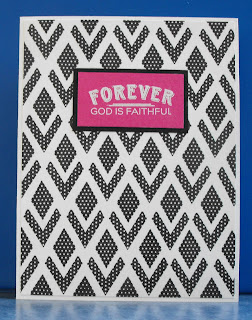
Forever Faithful

For the Papertrey Ink 2014 challenge, I cased this card, using elements from the Quilted: Winter stamp set, and the set New Every Morning, this time able to come closer to the original design than my last submission had.

Sunday, February 19, 2017

Birthday Snowflakes

The 2013 Challenge  with Papertrey was ... a challenge!  There just didn't seem to be any cards that I felt I could truly case, so I ended up going with this card, though I definitely personalized this one far more than some others I have cased with this challenge.  First, I did not have the large image used in the sample, so I chose snowflakes from the Quilted:Winter stamp set, but instead of doing them in straight lines, I curved them to give more of a "blowing snow" look. I cut the snowflake from the coordinating Quilted: Winter die set to add a bit more draw to the card, and also layered for more dimension.  The light grey snowflakes disappear in the photo, but they actually show up as well as the other colored flakes do.


Hold on to Hope

Papertrey Ink continues to provide great inspiration for me!  This entry is based on this card, posted as inspiration for the 2012 challenge, and is definitely a step outside my comfort zone in both design and technique.  I like things nice and neat, and this definitely does not qualify!  I also am not especially good with paint, so that was another discomfort level for me! This image is from the set New Every Morning,  stamped with versamark ink and embossing with white embossing powder, then painted over with various colors.  The card I cased this from had paint splatters, but I could not do that with my source, so just dabbed the paintbrush for a similar effect.


Thursday, February 16, 2017

In the News!

Papertrey's post for 2/15 was exciting in seeing that they have newspaper images! How fun!  I have long had a bunch of scans of our local newspaper that someone found in their attic and passed on to me.  As you can see by the card, the papers were in horrible condition.  Moisture had gotten in, so there was water damage, and they were all just crammed together in a corner.  I'd love to someday find a place that can scan and clean them up for me ... the stash is from a few days leading up to the declaration of war on Germany in 1917.  Fascinating stuff.  I had scanned a few pages on my pathetic scanner years ago, but never actually used any.  This challenge gave me the impetus to finally make a card with one of the scans.

This one is of a Wellsville Daily reporter paper published in March of 1917.  I chose the text “Happy Days” because Americans by and large were very isolationist, and therefore, were determined to stay out of the war,  and happily focused on local concerns.  Just weeks after this publication, however, Woodrow Wilson made the declaration that America was declaring war on Germany.

This was a difficult card to design because of the condition of the paper; I could not clean it up any better than this. I also wanted to feature as much of the text as possible because of the historical and cultural relevance for our small community.

The stamped text is from "Happy Hexagons."


Simple Thanks

Once again posting with Papertrey Ink's anniversary series.  These are very challenging for me, as I own so few Papertrey sets, but today, hurrah, I have a small order arriving that should help me out at least for a day or two!  This post I took inspiration from this card.  I used a Spellbinders label, and featured Papertrey's Big Basics: Thanks die.


Wednesday, February 15, 2017

Choose Joy!

Continuing with the 10 year celebration at Papertrey Ink this card comes from inspiration of this card, one of the many cards featuring images made in 2009 for the February 13th post.

By the way, if you like cultural history, each post in this series is a very well written description of primary cultural events of the year features, complete with pictures and relevant videos.  A lot of fun to see each year encapsulated this way.

This card uses the stamp set, New Every Morning, and the Joy die from the One Liners set. I made two of the joy dies so that I could have a 3D effect as well as bring the colors all together.


Hexagon joy!

I never get tired of the theme of Joy.  I believe it is an under-discussed aspect of being a believer that God longs for us to walk in!

Anyway, still working on cards for Papertrey Ink's 10 year anniversary celebration.  For this day's challenge, I chose a card to replicate with my own style and Papertrey supplies, which are fairly limited.  This makes the challenge of finding new designs all the more fun!  I chose this card for this purpose. It uses the Hexagon stamps, Hexagon die, and the Wonderful Words: Joy die.


New Mercies

Papertrey Ink is hosting yet another amazing giveaway, with ten chances to make cards that might be randomly selected.  I work best with deadlines, and have needed to build up my card stash, but just have not been motivated. So, this is great for me!  Each day has featured stamp sets from the ten years Papertrey has been in business, with the challenge to use the set if owned, or take inspiration from the examples, which is what I have done. This card follows after the "Text Box" set featured on February 11th, using two of my papertrey sets: New Every Morning, and Happy Hexagons.  The focal image is not a text box, but I "converted" it by (after first stamping a few hexagons in a different shade), stamping it with versamark and embossing with clear embossing powder, then framing it with decoratively cut post it notes, then sponged pink all over the space. I then removed the post-its, then ironed off the embossing powder.

Saturday, February 11, 2017

Roses, Roses!

This card was made for another challenge from Impression Obsession, Think Pink.  As I did with the last contest, I used Impression Obsession's CC043 Cover-a-Card Roses.   I am having so much fun with this stamp!  I love taking a single stamp and finding multiple ways to use it.  So, while I have other Cover-a-Card stamps, I might just continue posting with this one.  We'll see! This time, I embossed the image with clear embossing powder onto ivory cardstock, then sponged several shades of pink over the panel, then ironed away the embossing powder. I then stamped my one text stamp from Impression Obsession, the D4115 Thank You image.


Sunday, February 5, 2017

Wonderful the matchless grace!

This week's "Make it Monday" challenge over at PaperTrey Ink is "Pattern play with die cut silhouettes."  I forgot to note the design was to be clear and simple ... mine tend to lean that way in general, both because of style preference and skill level!  But, I might  have omitted punching the two corners had I read that. :-) Anyway, the point was to use a die cut with patterned paper.  I don't have any shapes at this point from PaperTrey, but I was very happy to use my "grace" die cut with one of the coordinating stamps.  I love how this method really emphasizes the word grace ... something so wonderful that Jesus freely gives us!


Saturday, January 28, 2017

Impression Obsession Challenge: Love is in the Air

My husband brought me some lovely roses last week, yellow tinged with pink.  I tried looking them up, but there are a number of roses these could have been. Anyway, they were beautiful, and I decided to recreate them with Impression Obsession's CC043 Cover-a-Card Roses. I have a fun pad of paper with different combinations of swirling color, and though I knew it was risking an over-busy card, I took the risk!  After embossing with gold, I chalked in yellow and pink for the roses, and green for the leaves to help them stand out from the pattern of the cardstock.

Impression Obsession's contests require only their products be used, and I had no appropriate stamps or dies for their challenge them of "Love is in the Air." But I have a drawer full of amazing brads from a company now out of business, and am always forgetting about them.  So, happily I thought of them and found one just the right color!  Since this card will be for my husband, after some deliberation, I decided not to add a ribbon bow in the upper left corner ... it's already a bit feminine to give!


Wednesday, January 25, 2017

Papertrey January Blog Hop Challenge

Papertrey Ink is holding a Blog Hop that instead of based on going to all their design team posts and commenting, the hop consists of patrons posting their cards, with encouragement for us to visit each other's blogs and comment.  I love this  idea ... and of course, I love the idea of some free stamps, for which their is a drawing for participants!

 The challenge is to use this picture as an inspiration:

Blog Hop Inspiration

This is what I came up with:


I love black, so this was a fun card for me to make.  The thanks die and the flowers, part of the New Every Morning set, come from PaperTrey Ink.

Tuesday, January 17, 2017

Safari Smash

I make smash books to sell at a fair at the college I attended years ago.  I keep meaning to post some, but never seem to have the time.  However, I am continuing to make similar books, and am absolutely loving Impression Obsession's line of "cover-a-card" stamps which are about 5.75" square.  I happened to realize late last night that they have a blog, and today is the final day of a contest for winning free stamps.   I knew I would not have time to make a card today, too many other things. But then I recalled this smash book, and lo and behold, I had a page that meets the contest requirement of something shiny.

The Impression Obsession "Shiny New Year Challenge" is to make a card with only IO stamps/dies, and it must include a shiny element.  So, to meet the challenge, here is the shiny:  I stamped the CC133 Cover-a-Card Leopard stamp,  with a pink craft ink, then sprinkled a sparkly pink powder just along the bottom.  I want people to be able to write on the smash book pages if they prefer journaling to attaching things, so I did not want the whole page coated.  If I were to do it again, I'd use a tiny spoon and make sure that the spots were totally coated, rather than embossed in half as I did it.


This is the cover.  As with nearly all my covers, it is made with wallpaper.


When stamping for writing, when the color is a bit dark, the writing is hard to read, and so this top one will be better for the purpose of attaching photos, memorabelia, etc. The one below, with the same ink, will be easier to read because of being blue-on-blue, and therefore, offering less contrast.


These pages were made using the CC133 Cover-a-Card Zebra.


I simply affixed a cut out square.  It must have been on the thick side, because of the non-straight edges.  However, it actually just looks like I used a scalloped square, so I kept it.


This seemed a fairly simple idea, but I made an error that made it very, very time consuming.  I cut 3/8" strips from a repositional label sheet, and laid them across the cardstock, then rolled the image over it.  I should have used a foam pad underneath the cardstock, because there were really big gaps in the image. So, I decided to draw lines on each side of the tape, and then to daub in the gaps.  It took forever.  So, if you do this, be sure to use a foam pad underneath!  Also, I have done this technique with another cover-a-card stamp, but I used the Cover-a-Card CC147 Journaling Lines stamp, then cut strips to lay between every other line, and that time I remembered my mouse pad, and it turned out beautifully.  (It was a borrowed stamp, which I did not have when I made this page, and that is the only reason I did not do it that way!)